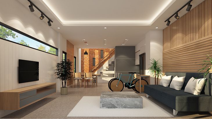
Popular layout mistakes: Interior tips
When creating a layout, you should always keep in mind the needs of your family - both in terms of privacy and storage.
That's why lots of people choose to design their layouts by themselves, but that's the exact reason why they make some popular layout mistakes.
Let's find out more about it to make sure that you won't make any of these mistakes in the future.
Ignoring Traffic Flow
Placing furniture or obstacles that disrupt the natural flow of movement in a room can be a problem.
Poor traffic flow can make a space feel cramped and inconvenient to navigate.

Mismatched Scale of Furniture
Using furniture that is too large or too small for the size of the room can create visual disbalance.
Incorrectly scaled furniture can make a room look unbalanced and either overcrowded or empty.
Neglecting Functionality
Prioritizing aesthetics over practicality in the layout can make your interior unusable.
A beautiful layout that doesn't meet the practical needs of the residents can lead to frustration and discomfort.
Disregarding Natural Light
Blocking or limiting natural light sources with poorly placed furniture or heavy window coverings can make your house uncomfortable.
Inadequate natural light can make spaces feel gloomy and affect the overall mood of a room.
Overlooking Storage Solutions
Not considering sufficient storage space for belongings can make your house cluttered.
Cluttered rooms without proper storage can create a disorganized and chaotic living environment.
Monotonous Color Schemes
Using only one or two colors throughout the entire house can make your house look boring.
Lack of color variety can make spaces feel monotonous and less visually interesting.
Not Planning for Flexibility
Designing a rigid layout that doesn't allow for changes or adaptation over time can lead to outdated designs.
Lifestyles and needs evolve, and a flexible layout accommodates these changes without requiring a complete overhaul.
