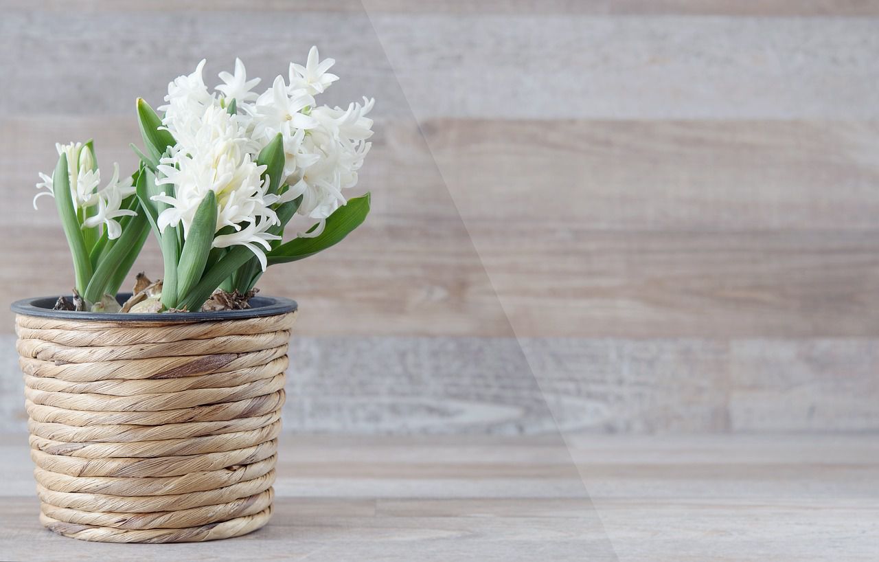
Negative doesn't always mean "bad" - for example, negative space can be very useful in interior design.
Negative space, also known as "empty" or "white" space, refers to the unoccupied areas within a room.
Let's find out more how to use it!

Simplicity and minimalism
Embrace a minimalist approach by decluttering and keeping furniture, decor, and accessories to a minimum.
Allow negative space to surround and highlight key elements, giving them breathing room and drawing attention to their presence.
Furniture arrangement
Avoid overcrowding the room and allow for visual gaps between furniture items.
This helps create a sense of openness and makes the room feel more spacious.
Wall treatments
Leave empty areas on walls to balance the visual weight of artwork or wall hangings.
This can enhance the overall aesthetic and prevent the space from feeling overwhelming.
Color and contrast
Use lighter or neutral colors for walls, ceilings, and large furniture pieces to create a sense of openness.
Then, incorporate pops of color or texture strategically to provide visual interest within the negative space.
Emphasize architectural features
Allow architectural elements such as windows, archways, or exposed beams to stand out by leaving negative space around them.
This draws attention to the unique features and adds character to the room.
Visual rest areas
Create visual rest areas by intentionally leaving portions of walls or surfaces empty.
These spaces can provide a sense of calm and balance amidst busier or more decorated areas.


