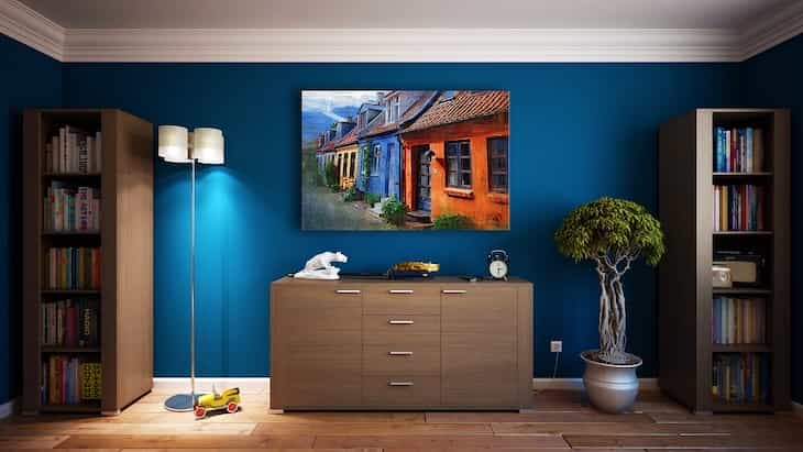
Decorative pictures or paintings can significantly improve your interior design, but only if they're good.
Some interior pictures can be tasteless or tacky, so it's better not to use them at all.
Here are the signs of pictures you shouldn't hang on your walls.

Lack of Cohesion
Pictures that don't complement the overall theme or style of the room won't help you.
Inconsistency in color schemes or themes can create a disjointed appearance.
Poor Quality Artwork
Low-quality prints, pixelation, or blurry images aren't great.
Artwork with visible imperfections can diminish the overall visual appeal.
Inadequate Sizing
Pictures that are either too small or excessively large for the space don't look great too.
Properly scaled artwork enhances the room, while incorrect sizing may appear awkward.
Overcrowding or Sparse Displays
Either too many pictures clustered together or an overly minimalistic approach can be bad.
Striking a balance is key to achieving a visually pleasing arrangement.
Mismatched Framing
Frames that clash with the artwork or each other.
Inconsistent framing styles or colors can create a distracting visual effect.
Lack of Focal Point
Signs: Absence of a clear focal point or dominant piece.
A well-chosen centerpiece draws attention and anchors the visual interest within the room.
Inappropriate Content
Artwork that doesn't align with the room's purpose or inhabitants' preferences.
Consideration for the function and occupants of the space is crucial.
Neglecting Negative Space
Filling every inch of wall space without leaving room for visual pauses.
Negative space is essential for balance and preventing visual clutter.
Failure to Reflect Personal Style
Artwork that doesn't resonate with the occupant's personality or style preferences.
Personal connection to the artwork contributes to a more meaningful and tasteful interior.
Recently, we talked about kitchen design trends.


