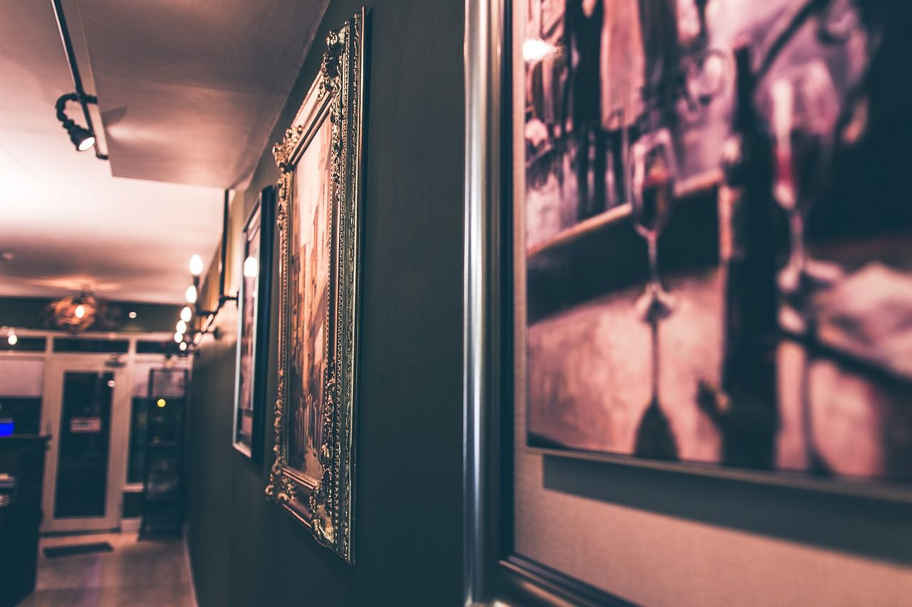
Why you should combine big and small pictures on your walls: Decorate your walls properly
Using only big pictures on your walls can make your room look smaller.
On the other hand, lots of small pictures can make your room look cluttered and overstimulating.
Here is why you should combine big and small pictures while decorating your walls.
Visual Hierarchy
By using a big picture as the centerpiece, you can anchor the wall and establish a visual hierarchy.
Smaller pictures can then be arranged around the larger one, adding depth and complementing the focal point.

Balance and Scale
If you only use large pictures, the wall may feel overwhelmed and visually heavy.
Adding smaller pictures brings a sense of scale and proportion, creating a more harmonious arrangement.
Flexibility and Adaptability
You can easily swap out or rearrange smaller pictures while keeping the larger one as a central element.
Personalization and Storytelling
Using both big and small pictures enables you to tell a visual story or convey personal significance.
The larger picture can represent a significant event, a cherished memory, or a favorite piece of art.
Surrounding it with smaller pictures can further enhance the narrative by including related images, snapshots, or mementos.
Design Cohesion
Incorporating a mix of sizes can help tie together different design elements in a room.
Spatial Illusion
Strategically placing smaller pictures around a larger one can create a sense of depth and dimension.
It can make the wall appear visually larger and more immersive.
