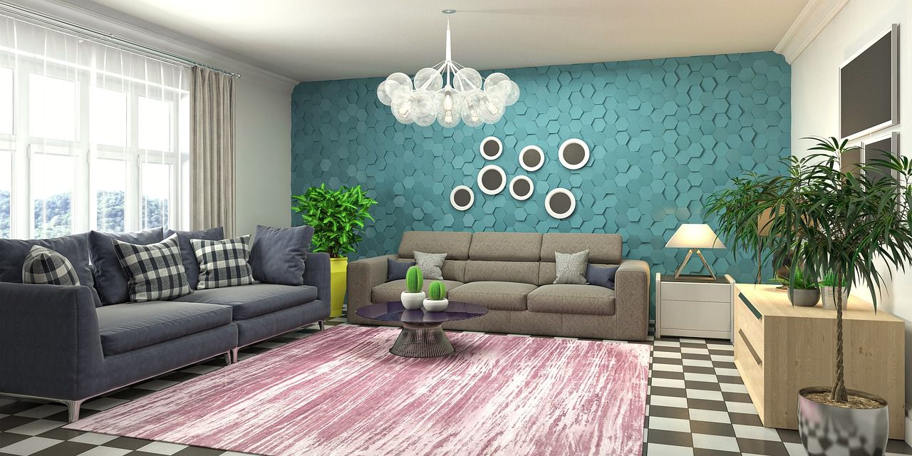
Interior fashion changes, and so do wallpapers - modern ones look quite different from what we used to like 10-15 years ago.
While everyone has their preferences and choices, there are a few types of wallpaper that won't make any interior look better.
Let's find out more about them and why they aren't that great.

Incompatible Colors and Patterns
If the colors and patterns on the wallpaper don't harmonize with the room's existing color scheme and decor, it can create a jarring effect.
For instance, a wallpaper with bright, clashing colors in a room with a subtle and neutral color palette can be visually unpleasant.
Overly Busy or Chaotic Designs
Wallpapers with extremely intricate, busy, or chaotic patterns can overwhelm a room.
They can make the space feel cluttered, and it may be challenging to find a focal point or feel relaxed in such an environment.
Poor Quality and Installation
Low-quality wallpapers can have issues like visible seams, wrinkles, or fading, which can make the room appear unkempt and unattractive.
Additionally, improper installation can exacerbate these issues.
Extreme Lightness or Darkness
Wallpapers that are either extremely dark or too light can disrupt the balance of the room.
Very dark wallpapers can make a space feel small, while overly light or bright ones can create a sterile or unwelcoming ambiance.
Dominance Overkill
If the wallpaper is too dominant, it can overshadow other design elements in the room.
It should enhance the overall design, not steal all the attention.
Striking the right balance between the wallpaper and other elements in the room is key.
Conclusion
In essence, wallpapers that don't look good in any interior are often those that create a visual clash, overwhelm the space, lack quality, or don't fit the room's style and ambiance.


